Apr30
Grey Fonts.
Editor’s Note
The image may be downloaded in higher resolutions:
↓ Transcript
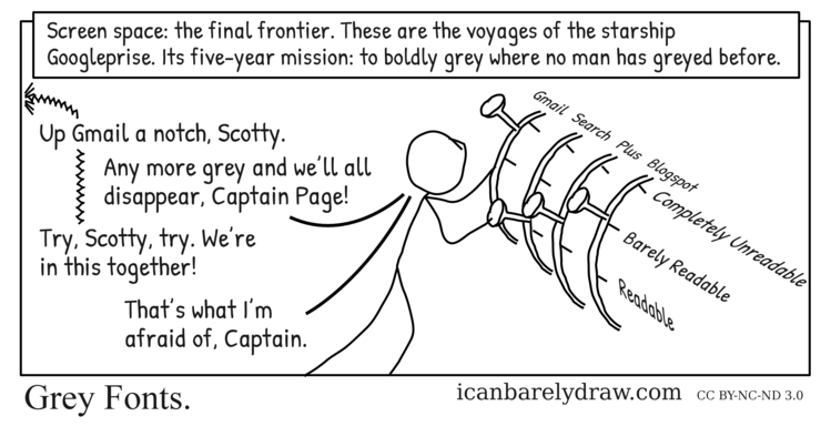
Narrator: Screen space: the final frontier. These are the voyages of the starship Googleprise. Its five-year mission: to boldly grey where no man has greyed before.
A man in standing in some sort of control room. Four large vertical semicircular controls are seen, each having a lever located at a different angle. On the right-hand-side of these four controls can be seen three labels, each marking a position along the semicircle of the controls. The lowest position is labeled: Readable. The middle position is labeled: Barely Readable. The highest position is labeled: Completely Unreadable.
The four controls bear labels identifying each one. From left to right, these are: Gmail, Search, Plus, and Blogspot.
The Gmail lever is located slightly lower than the position: Completely Unreadable.
The Search lever is located close to the position: Readable.
The Plus lever is located halfway between the positions: Barely Readable and Readable.
The Blogspot lever is located slightly higher than the position: Barely Readable.
The standing man is leaning forward against the controls. His left arm is on the circular part of the Gmail control, not near the Gmail lever. His right hand is touching the Search lever.
An off-panel voice, probably electronic as indicated by a zigzag connecting line, says: Up Gmail a notch, Scotty.
Man: Any more grey and we’ll all disappear, Captain Page!
Voice: Try, Scotty, try. We’re in this together!
Man: That’s what I’m afraid of, Captain.
Title: Grey Fonts.


This has certainly gotten pretty bad over the last few years. It’s like they don’t even look at the UI they’re designing, at least not on a typical LCD monitor.